Graphic Indicators
Together with numeric indicators, it is possible to see the indicators through comparative graphics. To do this, just select the type of graphic and what you want it to focus on.
The user can choose to focus the graph on any of the following options:
-
 Detail by Monitoring: gets the graph to compare the number of posts by monitoringTip: Select more than one monitoring to make a comparison between monitorings using this option. Go to the post filtering section and select the item Monitoring.
 -
 Detail by Source: gets the graph to compare the number of posts on each social media.
 -
 Detail by Sentiment: gets the graph to show a comparison of the posts in terms of sentiment.
 -
 Detail by Tag: gets the graph to compare the posts with different tags.
 -
 Detail by Language: gets the graph to compare the number of posts in each language.
 -
 Detail by Type: gets the graph to compare the different types of posts (such as Photos, Videos, Status updates, and Comments).
 -
 Detail by Likes on Posts: gets the graph to detail the number of likes on posts.
 -
 Detail by Comments on Posts: gets the graph to detail the number of comments on the posts.
 -
 Detail by Post Shares: gets the graph to detail the number of times posts were shared.
 -
 Detail by Location: makes the graph detail the number of posts according to the selected location. This can be selected in the “Advanced Chart Options”.
The user has the following options to change the graphic display:
-
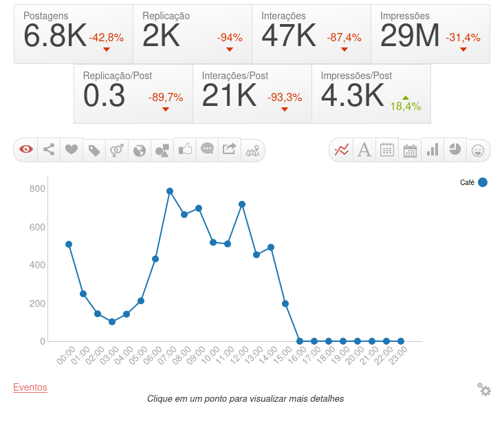
 Display Line Chart: allows you to see the comparison of the number of posts over a period of time. If the period selected in the filters (see filtering by Period, in Filtering Posts) is for one day, the graph will show the evolution of the number of posts hour by hour. If the time period is set to less than a month, the graph will show day-by-day statistics. If the time period is set to over a month, it will show monthly figures.Tip: When using periods longer than a day, the user can click on the graph to see a more specific period of time.
 -
 Display the Tag Cloud: shows the tag cloud for the posts selected.
 -
 Detail by Publications on each Day of the Week and Hour: gets a line graph with the seven days of the week (sunday, monday, tuesday, etc.), allowing to discover which day and hour occurs the largest amount of posts. When selected a period larger than one week, all the data is aggregated into one week for the whole period.
 -
 Detail by Interactions on each Day of the Week and Hour: gets a line graph with the seven days of the week (sunday, monday, tuesday, etc.), allowing to discover which day and hour occurs the largest amount of interactions. When selected a period larger than one week, all the data is aggregated into one week for the whole period.
 -
 Display Bar Chart: allows you to see the comparison of posts in the form of a bar chart.
 -
 Display Pie Chart: allows you to see the comparison of posts in the form of a pie chart.
 -
 Display the Emoji Cloud: shows the emoji cloud for the posts selected.
In the chart’s advanced options, the user can customize:
-
Region: choose whether you want to segment the information in the location graphs by city or by state.
-
Location Type: choose whether you want to use the detected, cited or author’s location in the location graphics.
-
Bar Stack: choose whether you want to group the bars according to sentiments, tags or not.
-
Bar size: choose how to arrange the information of the bars: in absolute values or percentage.
-
Interval between points: choose the time measurement unit for the interval between graph points: year, month, day, hour or minute.